
Graphic Design.
Selected branding and print work focused on clarity, consistency, and visual detail.
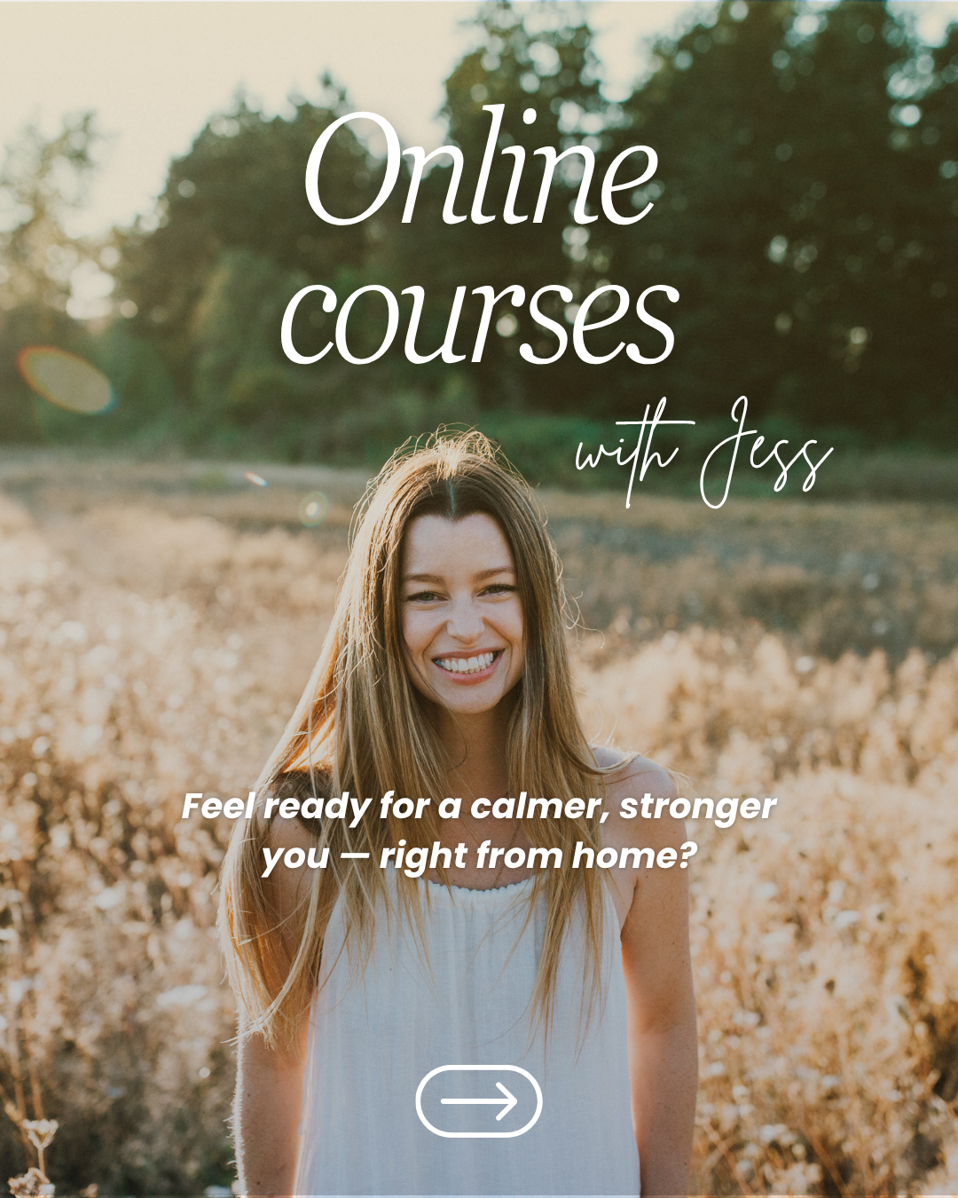
A Balanced Body- Awareness Campaign
This project focused on improving the clarity and consistency of communication across digital touchpoints for a wellness business.
The existing materials lacked structure, making it difficult for users to understand the offerings and take action quickly. I developed a clearer visual direction and created a series of social media and promotional assets that improved readability, hierarchy, and message focus.
The result was a more cohesive and accessible communication system that supported user engagement and course promotion.
This work included:
– Social media graphics (Instagram & Facebook)
– Promotional posters
– Event-based content
– Reusable templates for ongoing communication
Overview

Campaign Applications
Examples of assets developed for digital promotion


My Little Wild
This project focused on developing a cohesive visual identity and printed materials for a small product-based business.
The goal was to create a brand that felt soft and playful while maintaining consistency across all touchpoints.
The visual system combined simple layouts, a soft color palette, and illustrative elements to create a warm and approachable identity.
Overview
– Brand identity (logo and visual direction)
– Business cards
– Product labels
– Printed catalog
Deliverables
Business Card

Designed to reflect the brand through clean typography and balanced spacing. The layout prioritizes clarity while maintaining a soft and approachable visual tone.
Labels

Designed as small but consistent extensions of the brand, using simple layouts and illustration to maintain coherence across product touchpoints.
Catalog
The catalog was designed to present product information clearly while maintaining the brand’s visual identity. A structured layout and clear hierarchy support easy navigation and readability.

