
Designing a clear and intuitive experience to simplify how parents buy and resell children’s clothing.
UX Projects
Tiny Market Case Study
Tiny Market | App
Project Duration August - September 2024Overview
Tiny Market is a mobile platform designed to simplify how parents buy and resell children’s clothing.
The project focused on improving clarity and reducing friction by creating a more structured, intuitive experience through simplified navigation and a clear visual hierarchy.

The Problem
Parents face a common challenge: children outgrow clothing quickly, creating ongoing costs and clutter.
While resale platforms offer a solution, they often introduce new complexity. Interfaces can feel overwhelming, navigation is not always intuitive, and communication between users can be fragmented—turning a simple task into a time-consuming process.
I led the project from research to high-fidelity design, including user research, wireframing, interaction design, and visual design.
My focus was on translating user needs into a clear, structured, and intuitive experience.
My Role
Key Insights
Parents need fast, efficient interactions that they can complete on the go
Finding specific items is often time-consuming
Cluttered interfaces create unnecessary cognitive load
The Prototype
The high-fidelity prototype was designed to prioritize clarity and usability.
A consistent visual hierarchy, simplified interactions, and responsive layouts support users in completing tasks efficiently.


Outcome & Next Steps
The final solution improves clarity and reduces friction across key tasks such as browsing, selecting items, and coordinating exchanges.
It also establishes a scalable foundation for extending the experience across devices.
Tiny Market | Responsive website
Project Duration September 2024- November 2024

Overview
Tiny Market is not just a responsive website; it is a carefully designed platform that allows families to trade gently used children's clothing. By merging affordability with sustainability, Tiny Market gives quality clothes a second life, helping parents save money while also reducing waste. The entire experience is both enjoyable and functional. Through this project, I explored usability and harnessed the power of visual storytelling to foster trust and connection.
Design Approach
The design focused on simplifying interactions, improving content structure, and reducing cognitive load.
Clear categories, streamlined flows, and a consistent visual hierarchy support faster and more efficient decision-making.
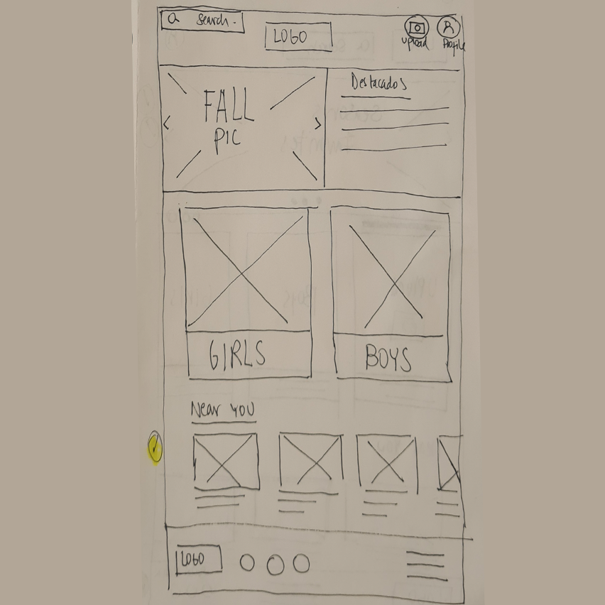
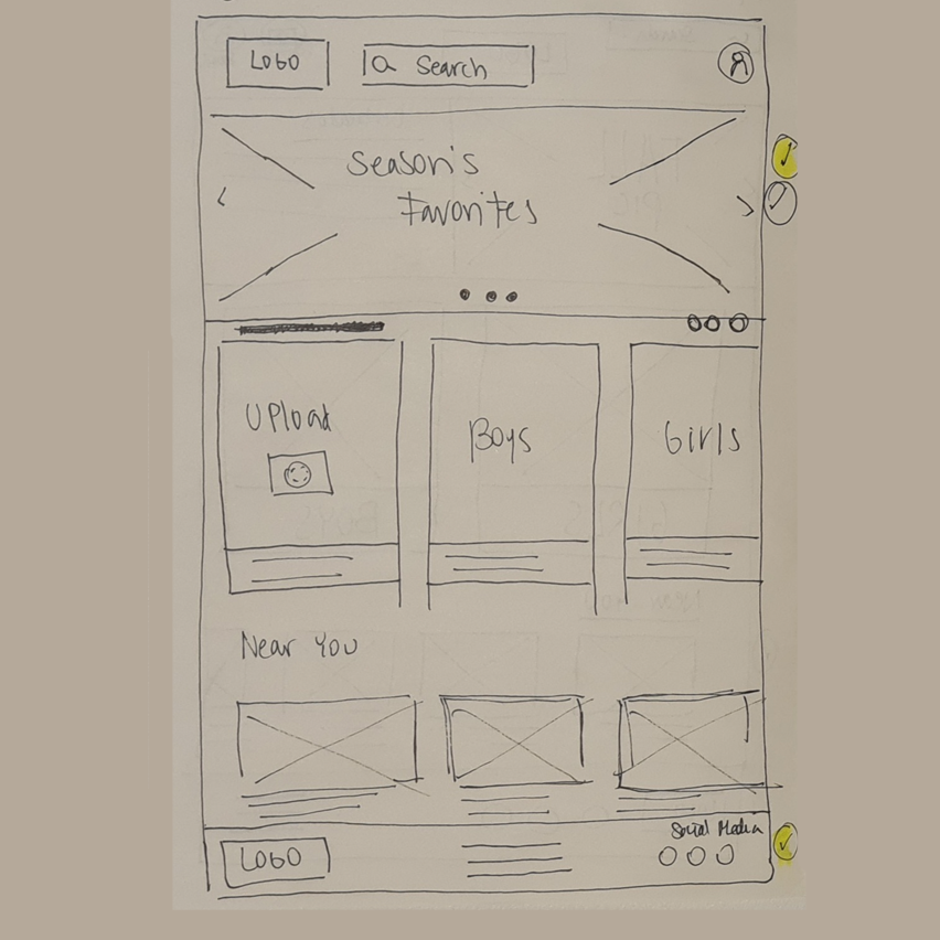
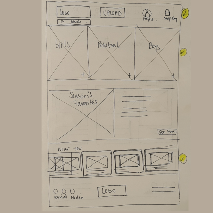
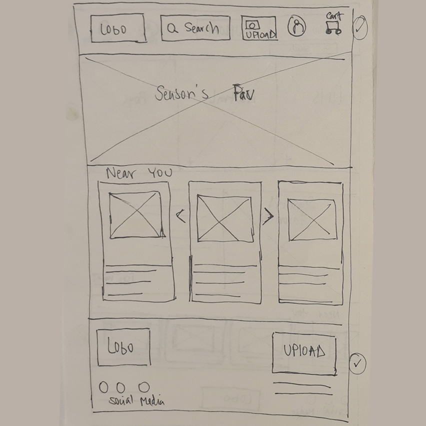
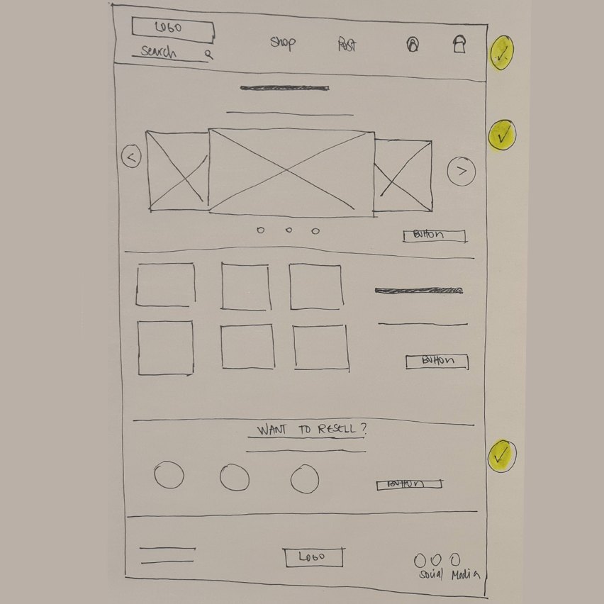
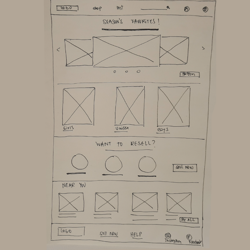
Paper wareframes
Every great design begins with a sketch. These early explorations helped define layout structure and prioritize key actions within the interface.
-
![]()
A.
-
![]()
B.
-
![]()
C.
-
![]()
D.
-
![]()
E.
-
![]()
Final version.
High-fi prototype
The high-fidelity prototype reflects a refined user journey focused on clarity, simplified interactions, and efficient navigation.
Key focus areas:
Clear visual hierarchy: Ensuring each step is easy to follow
Subtle interactions: Guiding users without adding complexity
Responsive design: Maintaining consistency across devices